
Why Navigation Is the Backbone of UX
Let’s face it—no matter how pretty your app or website looks, if people can’t figure out how to move around it, they’re gone. Poof. Just like that.
Navigation is like the GPS of your digital product. If users feel lost, they’ll take the next exit. But if the navigation feels intuitive? You’ve won half the battle. They’ll stick around longer, engage more, and maybe even convert. So, how do you create navigation that feels like second nature?
Let’s dive into the nitty-gritty of intuitive navigation design—and I promise, we’ll keep it fun and jargon-light.
What Exactly Is Intuitive Navigation?
Here’s the deal—intuitive navigation means users don’t need a map or a manual. They just get it. It feels natural, effortless, like walking into your favourite coffee shop and knowing exactly where to go.
If your grandma can find the “contact us” button without squinting or cursing under her breath, you’ve nailed it.
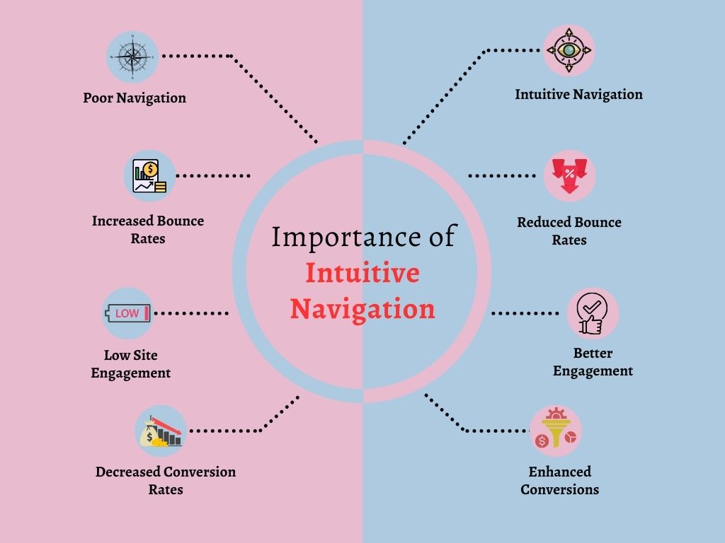
Why Intuitive Navigation Matters More Than You Think
Still wondering if this is all UX fluff? Think again. Here’s why great navigation is a game-changer:
- First Impressions Count: Users decide in seconds whether they’ll stay or leave.
- Reduces Friction: People don’t want to “learn” your app. They want to use it.
- Boosts Conversions: When navigation flows naturally, users reach their goal faster—be it a purchase, a signup, or just reading more.
- Improves Retention: Users return to experiences that are smooth and stress-free.
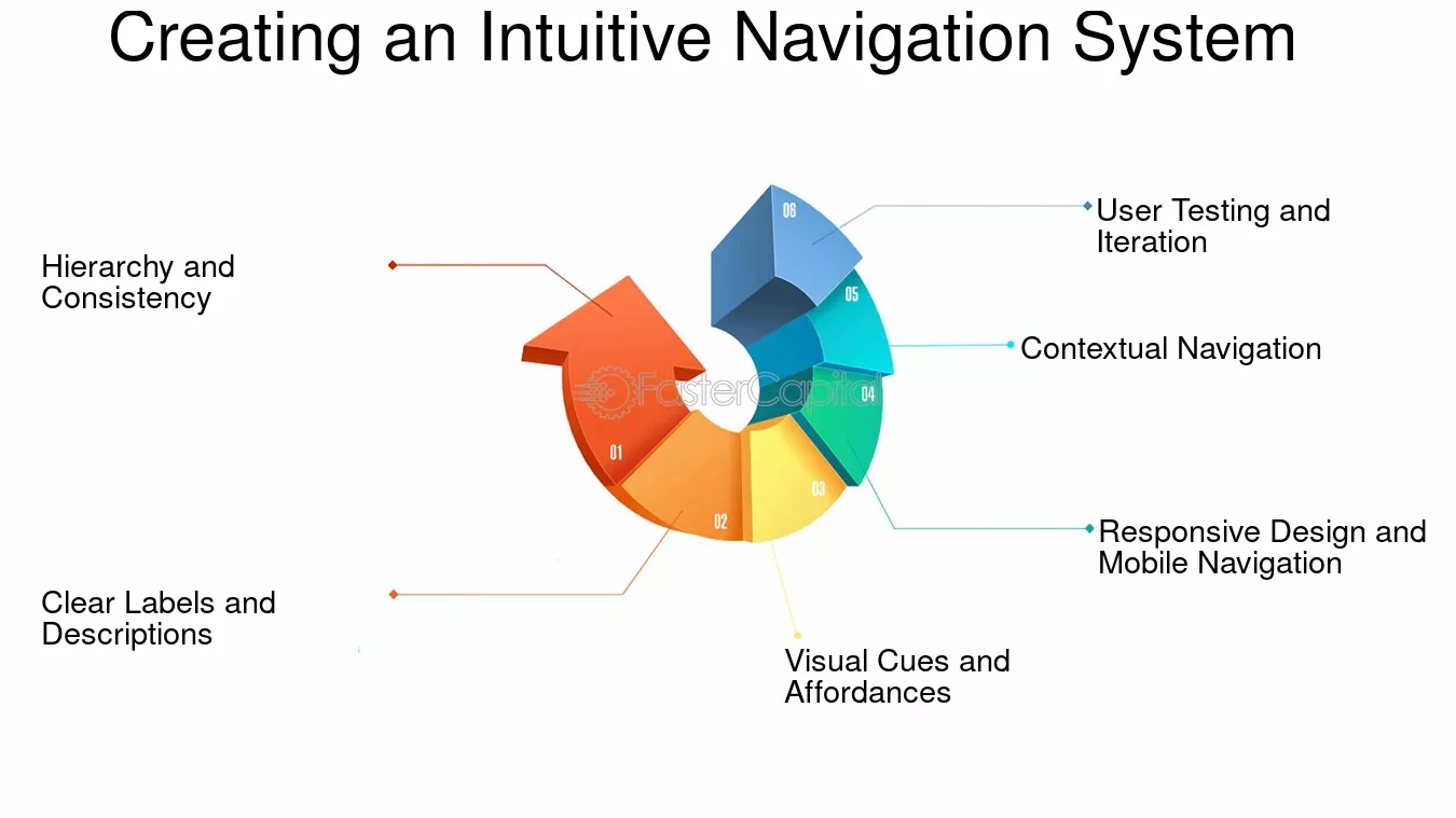
Step 1: Start with the User’s Mindset
Before you sketch a single wireframe, put yourself in your user’s shoes.
Ask yourself:
- What’s the first thing they’ll want to do?
- What problems are they trying to solve?
- Where do they expect certain options to be?
It’s not about where you think something should go. It’s about where they would expect it to be. Don’t make them think twice.
Pro tip: Use user interviews, surveys, and journey maps to gather real insights. Data beats guesswork, every time.
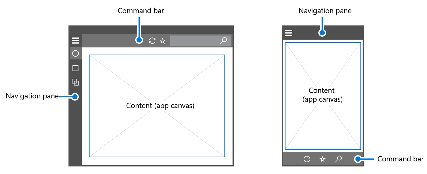
Step 2: Follow Familiar Patterns
You don’t need to reinvent the wheel. People are used to certain layouts:
- Hamburger menus on mobile? Totally fine.
- Navigation bar at the top on desktop? Yep, that’s the sweet spot.
- Logo that links to home? Expected and appreciated.
Stick to conventions—at least for your primary structure. That’s not lazy design; that’s smart design. Creativity should enhance usability, not confuse it.
Step 3: Keep It Clean and Clear
Clutter is the enemy of intuition. When users are faced with too many choices, they freeze. Or worse—they bounce.
Here’s what to do:
- Limit your main menu to 5-7 core items
- Use clear labels (Avoid cutesy or vague terms. “Our World” means nothing. “About Us” does.)
- Stick with logical groupings (e.g., don’t hide “Support” under “Features”)
Remember: Confusion kills conversions.
Step 4: Use Visual Hierarchy Like a Pro
Your users’ eyes follow a certain path—help guide them.
- Size matters: Bigger = more important.
- Positioning rules: Top-left gets attention first.
- Colour and contrast: Use bold colours for primary actions, subtle tones for secondary ones.
- Whitespace is not wasted space: It gives breathing room and focus.
If you want users to click something, make it obvious. Not obnoxious—just obvious.
Step 5: Prioritise Mobile First (Even If You’re Designing for Desktop)
More than half of web traffic comes from mobile devices. And apps? Well, they’re mobile by nature. So don’t treat mobile design as an afterthought.
Here’s how to nail mobile navigation:
- Use a sticky bottom nav with 3–5 icons for key actions.
- Ensure your buttons are thumb-friendly (at least 44px tap targets).
- Minimise layers—don’t bury actions under five menus deep.
- Keep text short and legible on small screens.
Mobile users are multitasking, distracted, and impatient. Help them out.
Step 6: Test It Like Crazy
Think your navigation is intuitive? Great. Now prove it.
Do usability testing—and not just once:
- Conduct first-click tests: Where do users click first to complete a task?
- Watch them navigate without guidance
- Ask them to talk through their experience
The goal? Spot where they hesitate, get stuck, or wander. That’s your cue to simplify or rearrange.
Bonus tip: Use heatmaps or analytics tools like Hotjar to see actual user behaviour.
Step 7: Make Search Work Like Magic
Even with perfect navigation, some users still prefer to type.
Here’s how to make your search bar super helpful:
- Make it easy to find—don’t hide it!
- Use autocomplete and suggestions
- Support misspellings and synonyms
- Highlight relevant results first
Search is like a shortcut—so don’t turn it into a dead-end.
Step 8: Don’t Forget Microcopy
Microcopy = small words, big impact.
That includes:
- Menu labels
- Button text
- Error messages
- Tooltips
Use language that guides. Be human, be clear, and keep it short. “Oops! We couldn’t find that page.” is better than “404 error.”
Step 9: Design for Accessibility
Intuition isn’t universal—accessibility matters. If your nav doesn’t work for users with disabilities, it’s not intuitive. It’s exclusive.
Do this:
- Use semantic HTML (like
<nav>,<ul>,<a>) - Ensure keyboard navigation works
- Add ARIA labels for screen readers
- Maintain strong colour contrast
Accessibility isn’t just ethical—it’s smart UX.
Step 10: Evolve with Feedback
Your job isn’t done after launch.
Monitor user behaviour. Track drop-offs. Listen to feedback. What worked yesterday might not work tomorrow.
Iterate often. Think of navigation as a living, breathing thing. Keep it fresh, functional, and aligned with your users’ evolving needs.
TL;DR
Designing intuitive navigation isn’t about flashy features or clever tricks. It’s about clarity, empathy, and simplicity.
Put the user first. Follow patterns that make sense. Clean up clutter. Test obsessively. And above all—make every click feel effortless.
If you do that? Your users will stay longer, do more, and come back for more.
FAQs
What are common navigation mistakes to avoid?
Overcomplicating the menu, using vague labels, hiding important links, and not testing on mobile are top offenders.
How many items should I have in a navigation menu?
Stick to 5–7 main items max. Too many choices overwhelm users and reduce clarity.
Should I always include a search bar?
Yes—especially for content-heavy apps or sites. It helps users find what they need faster.
What tools can I use to test navigation usability?
Try tools like Maze, Hotjar, Crazy Egg, or simply conduct moderated user testing sessions.
Is hamburger menu bad UX?
Not necessarily. It’s expected on mobile, but on desktop, make sure it doesn’t hide critical actions users need quickly.